PROJECT OVERVIEW
-
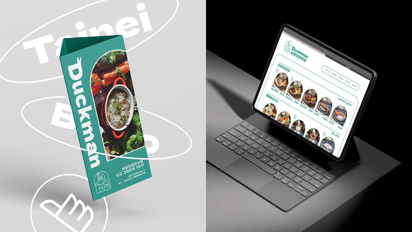
Duckman 是一間位於台北市的輕食餐盒店,主打以舒肥烹調的方式,讓餐點吃得更清爽也更營養,提供在都市生活忙碌的上班族群輕鬆享用健康飲食的新選擇。
在一眾以食物為視覺重點的競爭市場中,有物以擬人化的手法打造品牌識別角色,讓Duckman在琳琅滿目的輕食餐盒中,樹立清新獨特的品牌形象。
Duckman is a light meal box shop located in Taipei City. It specializes in Sous Vide cooking methods to make meals more refreshing and nutritious. It provides a new choice for office workers who live a busy urban life to easily enjoy healthy meals. There are Using anthropomorphic to create brand identity characters, establishing a fresh and unique brand image in the dazzling light meal box market.
DESIGN CONCEPT
-
餐廳主打醬料經由主廚顧問研發,提供不同於一般水煮餐盒的精緻美味;蔬菜由自家提供,隨季節更換菜單,讓健康更有保障,餐點使用餐廳等級的食材層次與料理手法,卻不用花大把時間與金錢,讓忙碌的上班族能以輕鬆、沒有壓力的方式享用健康又美味的餐點。
因此在品牌設計方向上,有物以 “ Chill 鴨男 ” 的形象進行規劃,角色愜意的神情與放鬆的姿勢,表現輕鬆幽默的品牌個性,如同品牌以親切的方式傳遞健康美味的舒肥料理。
The brand design direction uses the image of "Chill Duckman" for overall personality planning. The cozy look and relaxed posture show the relaxed and humorous side of the brand. The color scheme is mainly green, conveying the trendy and healthy experience, and is decorated with professional gray, balanced yellow, passionate red and nutritious orange are used as secondary colors to present the brand's vividness and richness.
LOGOTYPE CONCEPT
-
英文標準字選用粗壯厚實的無襯線字型,傳遞品牌「健康美味一次到位」的滿足感,“ D ” 字上方加上鴨男插畫的兩根瀏海增加趣味性,中文標準字則使用較為活潑的字型,讓整體標誌給人活力十足的印象,在多媒體運用中也更為豐富多變。
The English logotype use thick sans-serif fonts to convey the brand's satisfaction of "healthy and yummy at once." The two bangs of Duckman's illustration are added above the "D" character to add interest, while the Chinese logotype use a more The lively font gives the overall logo a vibrant impression.
Visual Design Agency | Zerodeisgn 有物設計
Art Direction | Fred Chao
Visual Design | Owen Hsu
Client | Duckman 舒肥輕食餐盒
Date | 2023